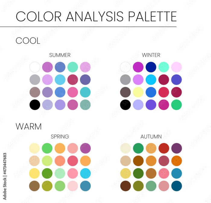
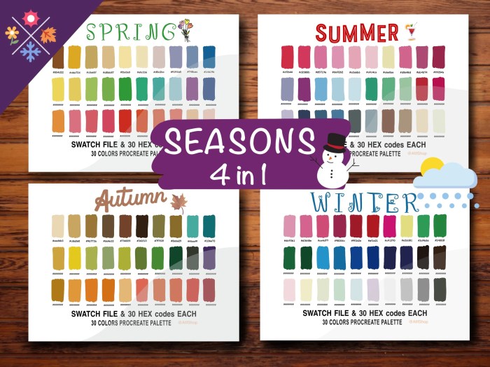
Seasonal color palettes rule the design world with a mix of trend-setting hues and creative inspiration, influencing everything from fashion to marketing with their dynamic shades. Get ready to dive into a kaleidoscope of colors that define each season in style!
Introduction to Seasonal Color Palettes

Seasonal color palettes are curated sets of colors that are specifically chosen to represent the essence of each season. These color schemes play a crucial role in design as they help evoke certain moods, emotions, and associations tied to each time of year.
They have a significant impact on various industries like fashion, interior design, and marketing. In fashion, designers use seasonal color palettes to create collections that resonate with the current trends and the atmosphere of the season. In interior design, these color schemes are utilized to transform spaces and reflect the changing seasons. In marketing, seasonal color palettes are employed to attract consumers by tapping into their seasonal preferences and creating visually appealing campaigns.
Popular Seasonal Color Schemes
- Spring: Soft pastels like blush pink, mint green, and sky blue are often used to reflect the blooming flowers and fresh beginnings of spring.
- Summer: Bright and vibrant colors such as sunny yellow, turquoise, and coral are commonly seen during the summer months to convey a sense of warmth and energy.
- Fall: Rich earth tones like burnt orange, deep red, and mustard yellow dominate fall color palettes to mirror the changing leaves and cozy atmosphere of autumn.
- Winter: Cool tones like icy blue, silver, and white are popular in winter color schemes to capture the serene and chilly vibe of the season.
Creating Seasonal Color Palettes
When it comes to creating seasonal color palettes, it’s all about capturing the essence of each season through a harmonious blend of colors. Whether you’re designing a website, creating artwork, or planning a wardrobe, selecting the right colors can help evoke the mood and feel of a specific time of year.
Deriving inspiration from nature is a great way to choose colors for each season. For example, in the spring, you might be drawn to pastel shades like soft pinks, greens, and yellows reminiscent of blooming flowers and fresh growth. Summer could inspire vibrant hues like turquoise, coral, and sunny yellow, reflecting the warmth and energy of the season.
To effectively combine and balance colors for different seasons, consider using the color wheel as a guide. Complementary colors (those opposite each other on the wheel) can create a dynamic contrast, while analogous colors (those next to each other) offer a more harmonious blend. Don’t be afraid to experiment with different shades and tones to achieve the desired effect for each season.
Tips for Combining and Balancing Colors
- Start with a base color that represents the dominant mood of the season, then add accents in complementary or analogous shades to create depth and interest.
- Consider incorporating neutral tones like white, beige, or gray to balance out bold or bright colors and prevent the palette from becoming overwhelming.
- Pay attention to the intensity of colors – mixing light and dark shades can add dimension and visual interest to your design or outfit.
- Don’t forget about the power of textures and patterns – incorporating different textures can enhance the overall look and feel of your color palette.
Spring Color Palette: Seasonal Color Palettes
Spring color palettes are typically characterized by soft pastel hues, vibrant shades, and nature-inspired tones that evoke feelings of renewal and freshness. These colors are often associated with blooming flowers, clear skies, and the overall sense of new beginnings that come with the spring season.
Characteristics of a Typical Spring Color Palette
- Pastel shades like soft pink, light blue, mint green, and lavender
- Vibrant colors such as coral, peach, and sunny yellow
- Nature-inspired tones like grass green, sky blue, and earthy browns
- Floral hues including rose, lilac, and daffodil yellow
Examples of Colors Associated with Spring
- Soft Pink: reminiscent of cherry blossoms in bloom
- Lavender: evokes the scent of fresh lavender fields
- Sunny Yellow: represents the warmth of the sun returning after winter
Incorporating Spring Colors into Design Projects
When designing with a spring color palette, consider using these colors to create a sense of lightness, joy, and rejuvenation in your projects. Pair pastel shades with neutrals for a soft and soothing look, or combine vibrant hues for a bold and energetic feel. Nature-inspired tones can bring a sense of harmony and balance to your designs, while floral hues add a touch of elegance and femininity.
Summer Color Palette
Summer color palettes are all about vibrant and refreshing hues that evoke the essence of the season. These colors are often bright, cheerful, and reminiscent of sunny days at the beach.
Warmth and Relaxation
Summer color palettes bring a sense of warmth and relaxation to any space they are used in. From the golden yellows of the sun to the calming blues of the ocean, these colors create a soothing and inviting atmosphere.
Lively Atmosphere
By incorporating summer colors into your decor or design, you can instantly transform the mood of a room or a piece of artwork. Bright oranges, tropical greens, and sky blues can infuse energy and liveliness into any space, making it feel like a perpetual summer vacation.
Fall Color Palette

Fall color palettes are characterized by rich, earthy tones that reflect the changing season. These colors symbolize transition, coziness, and the bountiful harvest that comes with autumn.
Integration of Fall Colors
There are various ways to incorporate fall colors into design schemes to capture the essence of the season:
- Choose warm hues like deep reds, burnt oranges, and golden yellows for accent walls or furniture pieces.
- Accessorize with throw pillows, blankets, or rugs in shades of brown, rust, or olive green to add a cozy touch.
- Use natural elements such as dried leaves, pine cones, or acorns as decor to bring the outdoors inside.
- Opt for rich, dark wood finishes or copper accents to complement the fall color palette.
Winter Color Palette
Winter color palettes are all about cool, icy hues and warm, cozy shades that evoke the feeling of the season. These colors convey a sense of calmness and festivity, perfect for creating a cozy ambiance in design projects.
Cool, Icy Hues
Winter color palettes often include shades of blue, silver, and white, reminiscent of snow and ice. These cool tones can bring a sense of serenity and tranquility to any design.
Warm, Cozy Shades, Seasonal color palettes
In contrast to the icy hues, winter colors also feature warm tones like deep reds, forest greens, and rich browns. These colors add a sense of warmth and comfort, perfect for creating a cozy atmosphere during the cold winter months.
Creating a Cozy Ambiance
To use winter colors effectively in design projects, consider combining cool and warm tones for a balanced look. Experiment with different shades to evoke the feeling of winter, whether it’s a snowy landscape or a warm fireplace.